Clean Up Australia
UX/UI design
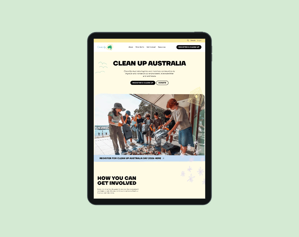
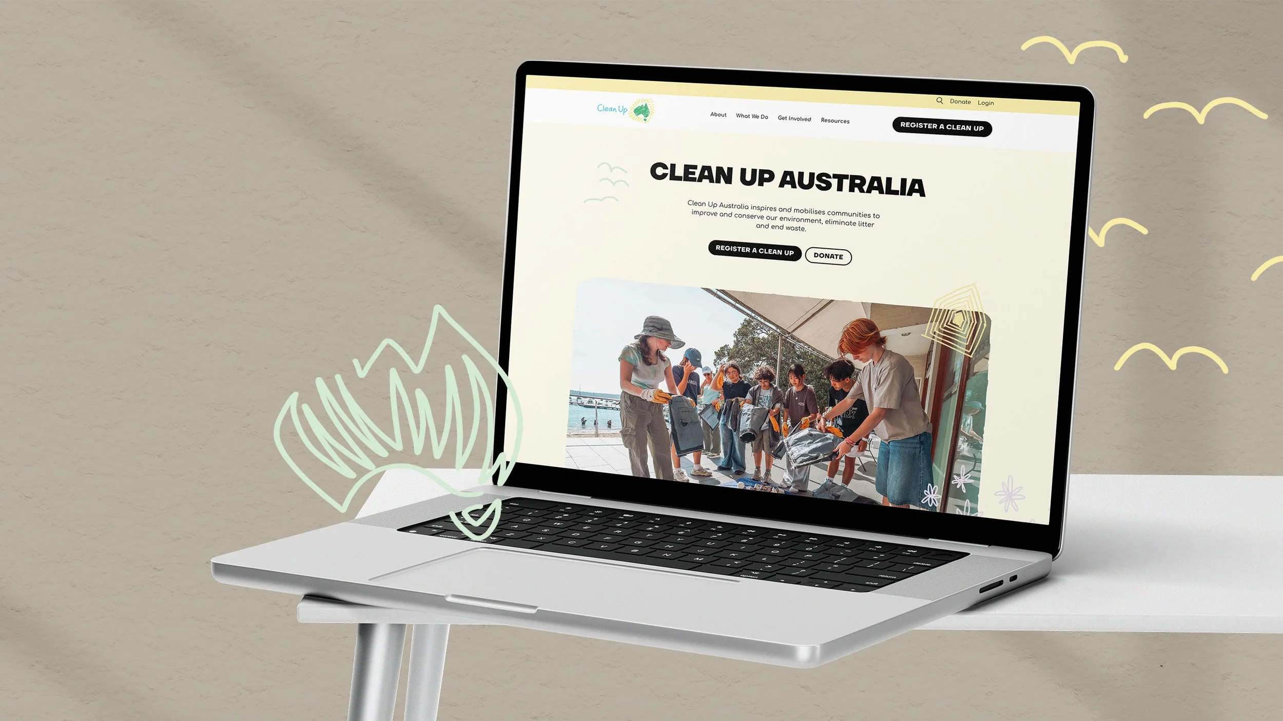
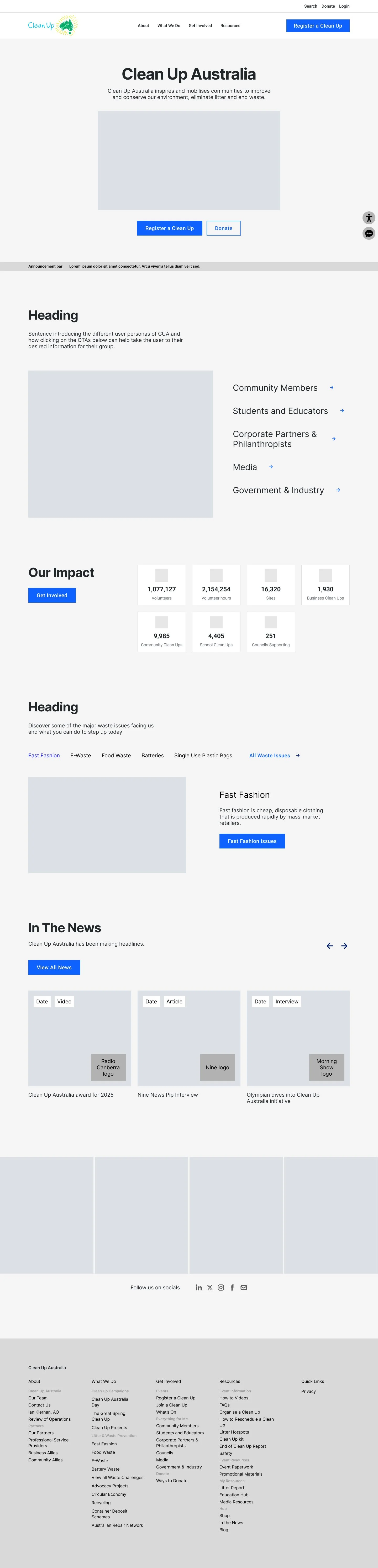
Clean Up Australia inspires and mobilises communities to improve and conserve our environment, eliminate litter and end waste.
Challenge
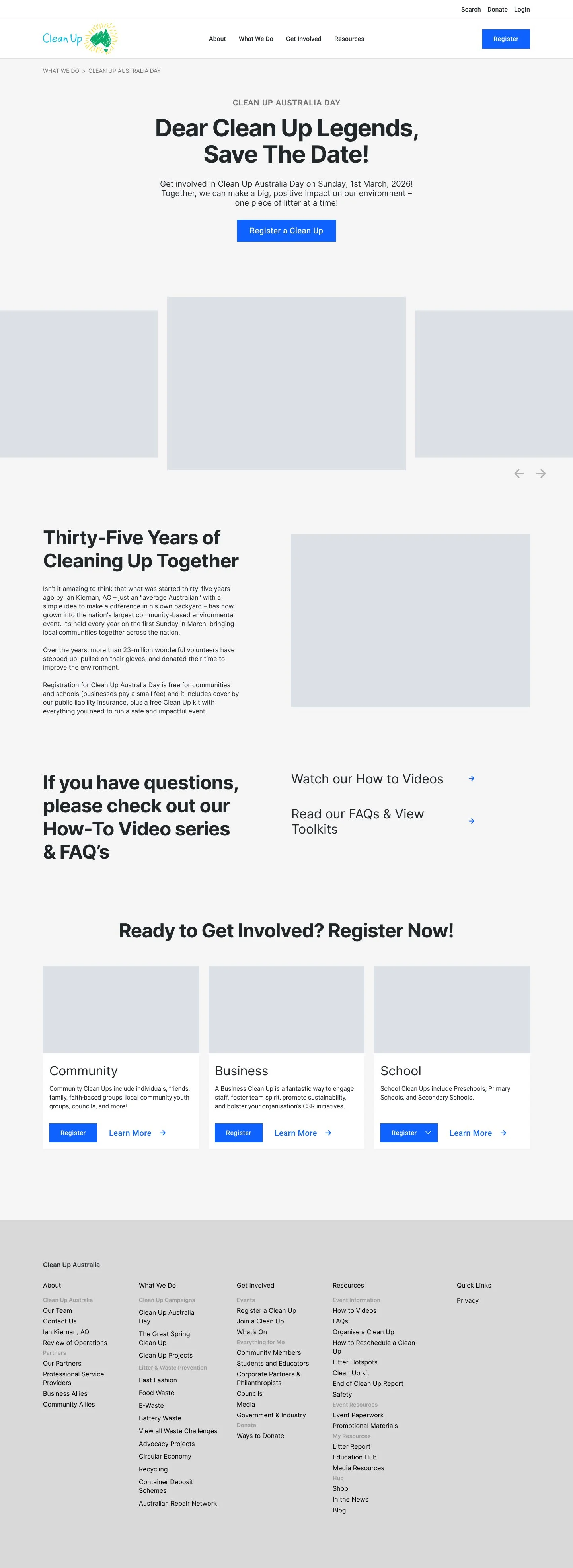
My largest website redesign to date, Clean Up Australia needed an information architecture built to serve a diverse audience; volunteers, schools, corporate partners, and donors. The existing site lacked clear pathways, making it difficult for users to quickly find what was relevant to them.
Solution
I started by collaborating with the SEO team and developer to review over 400 existing URLs, identifying pages of highest priority and hierarchy. These insights shaped a refined sitemap and simplified user journeys tailored to each audience segment, from first-time volunteers to long-term corporate partners.
Deliverables
UX/UI Analysis
Website Design and Development
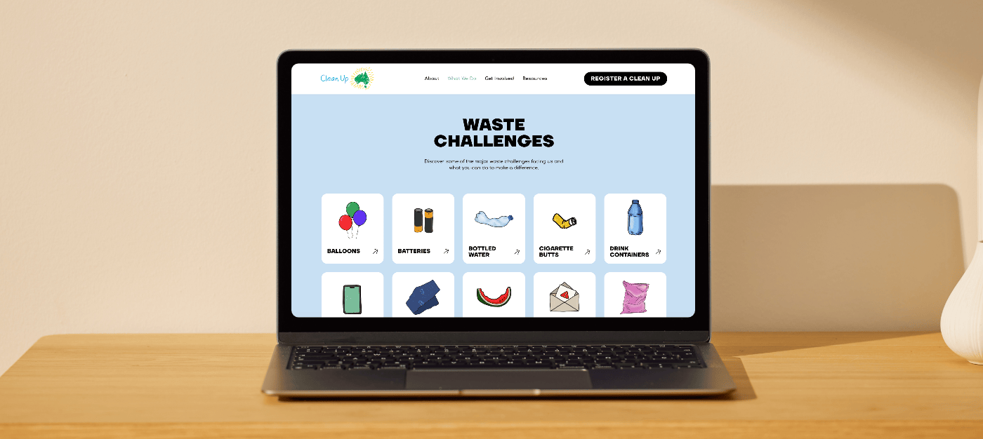
Custom Illustrations
UX Design
To inform the new architecture, I benchmarked leading NGOs including Greenpeace, WWF, OzHarvest, and Movember, looking for common threads in how they structure language, calls to action, and navigation. Movember was a particular reference point: like Clean Up Australia, they needed to evolve beyond a single campaign moment into a year-round destination.
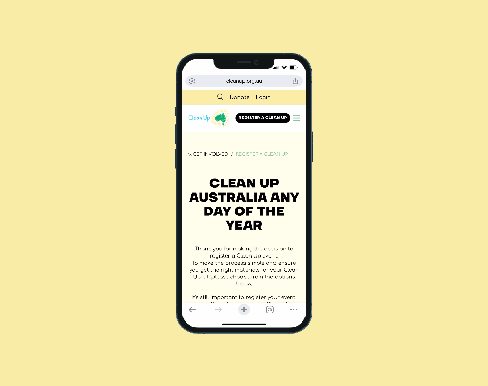
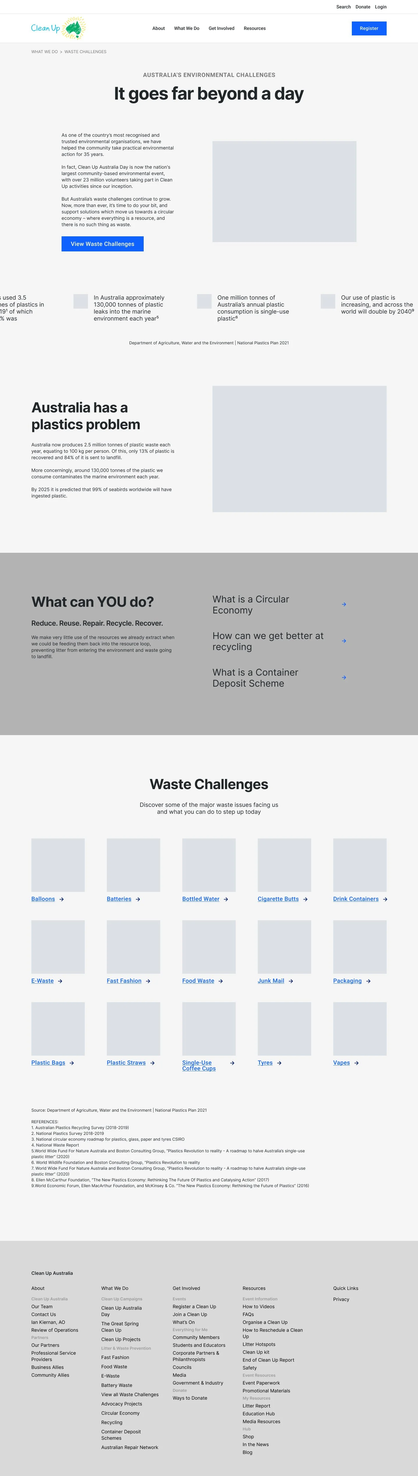
Tracing 20 years of Movember's website iterations showed how their IA and content strategy shifted as their ambition grew beyond one day. These insights directly shaped Clean Up Australia's new sitemap, which needed to serve not just annual clean-up events, but a constantly active platform, with recurring projects, waste prevention guides, and recycling information that users could rely on throughout the year.
Structure
I take pride in maintaining a clear and structured Figma workflow, ensuring designs are logically organised and easy for developers to interpret. From consistent naming conventions to considered component systems, my approach supports a smooth and efficient handover from prototype to build.
UI Design
With the structure in place, I evolved the brand visually, introducing custom illustrations, motion design, and micro-interactions to bring warmth and energy to the experience. Clearer calls to action and a more accessible layout balanced the storytelling with usability.