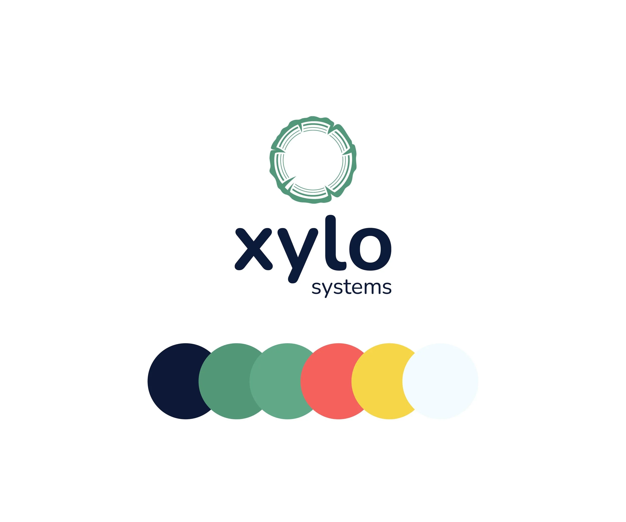
Xylo systems
Logo & Branding
Xylo systems is a biodiversity platform that uses data to help businesses make informed decisions on areas to prioritise for protection and where to release animals in the wild.
Challenge
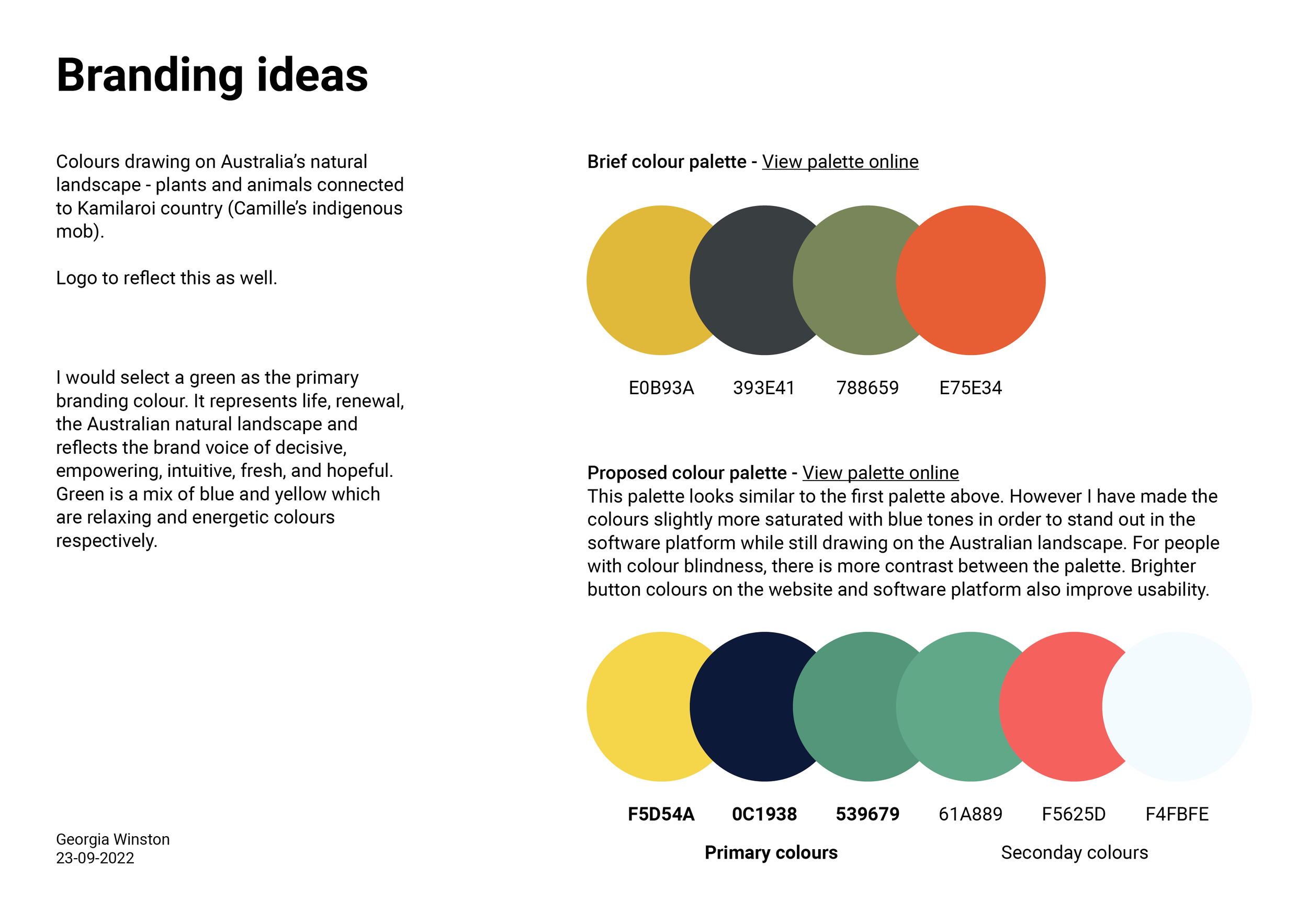
While I was freelancing, Xylo Systems reached out for a logo that bridged wildlife conservation and tech, reflecting the Australian landscape and Kamilaroi country. The design had to be accessible for their software platform and resonate with science-educated professionals in Australia and New Zealand, with potential for global appeal.
Solution
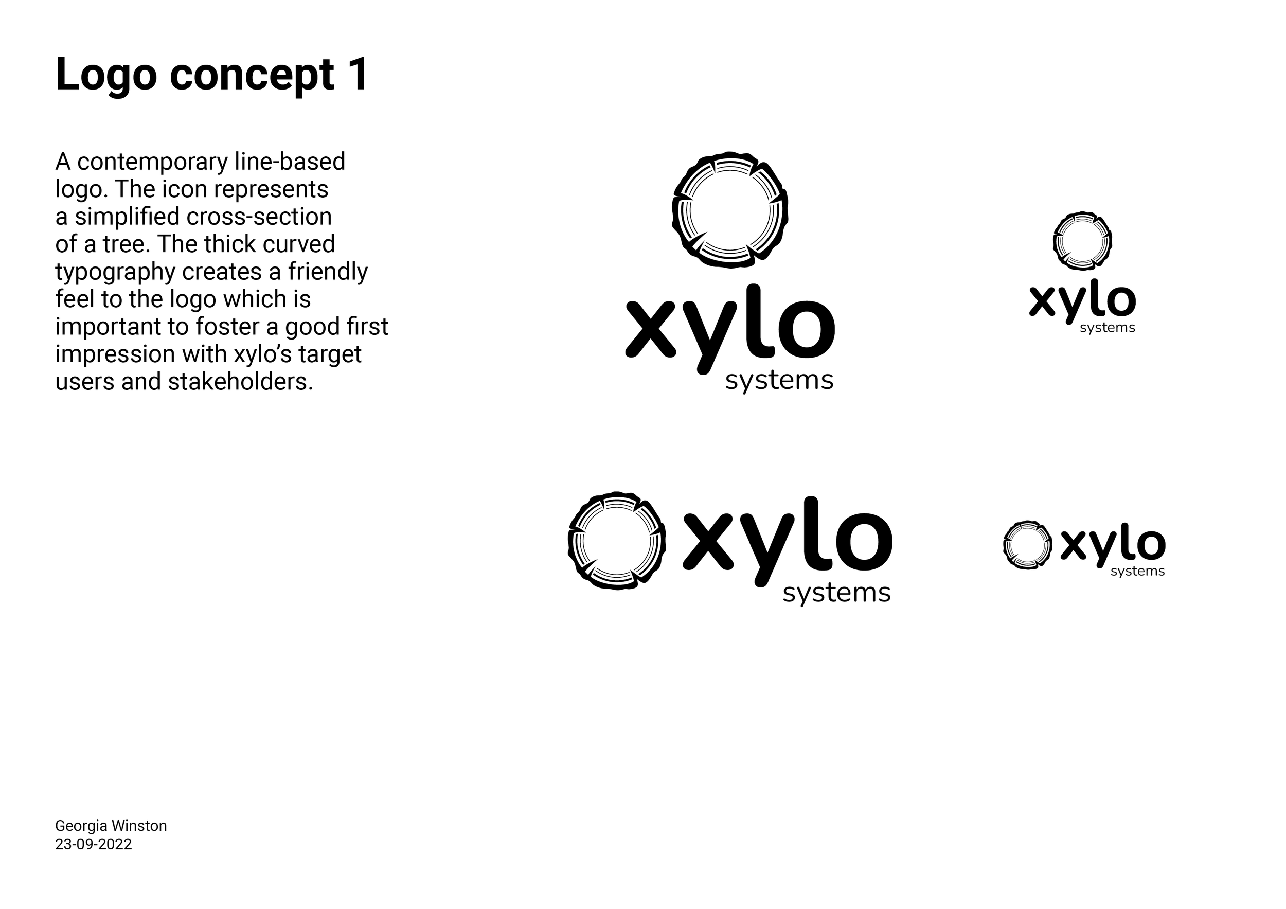
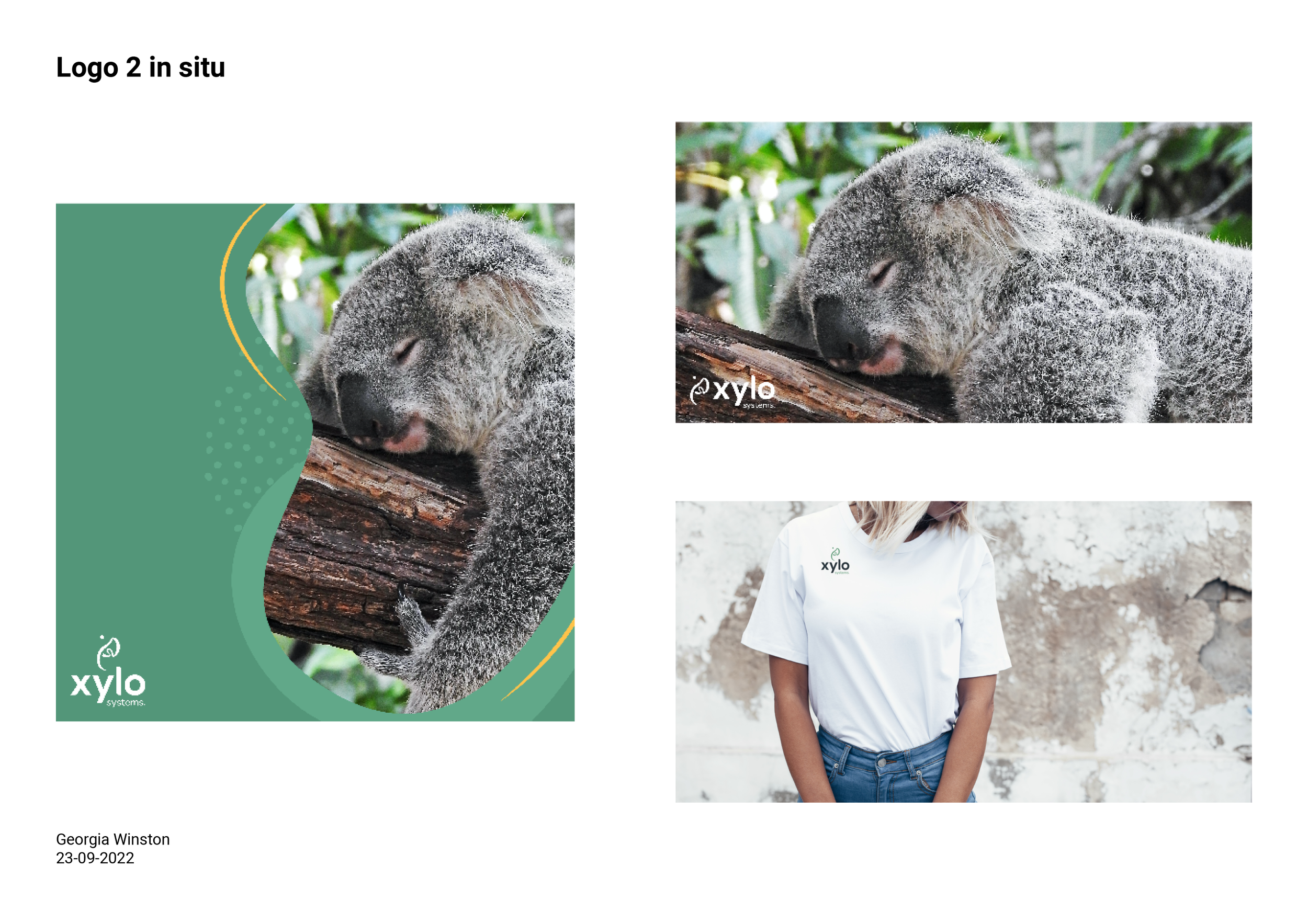
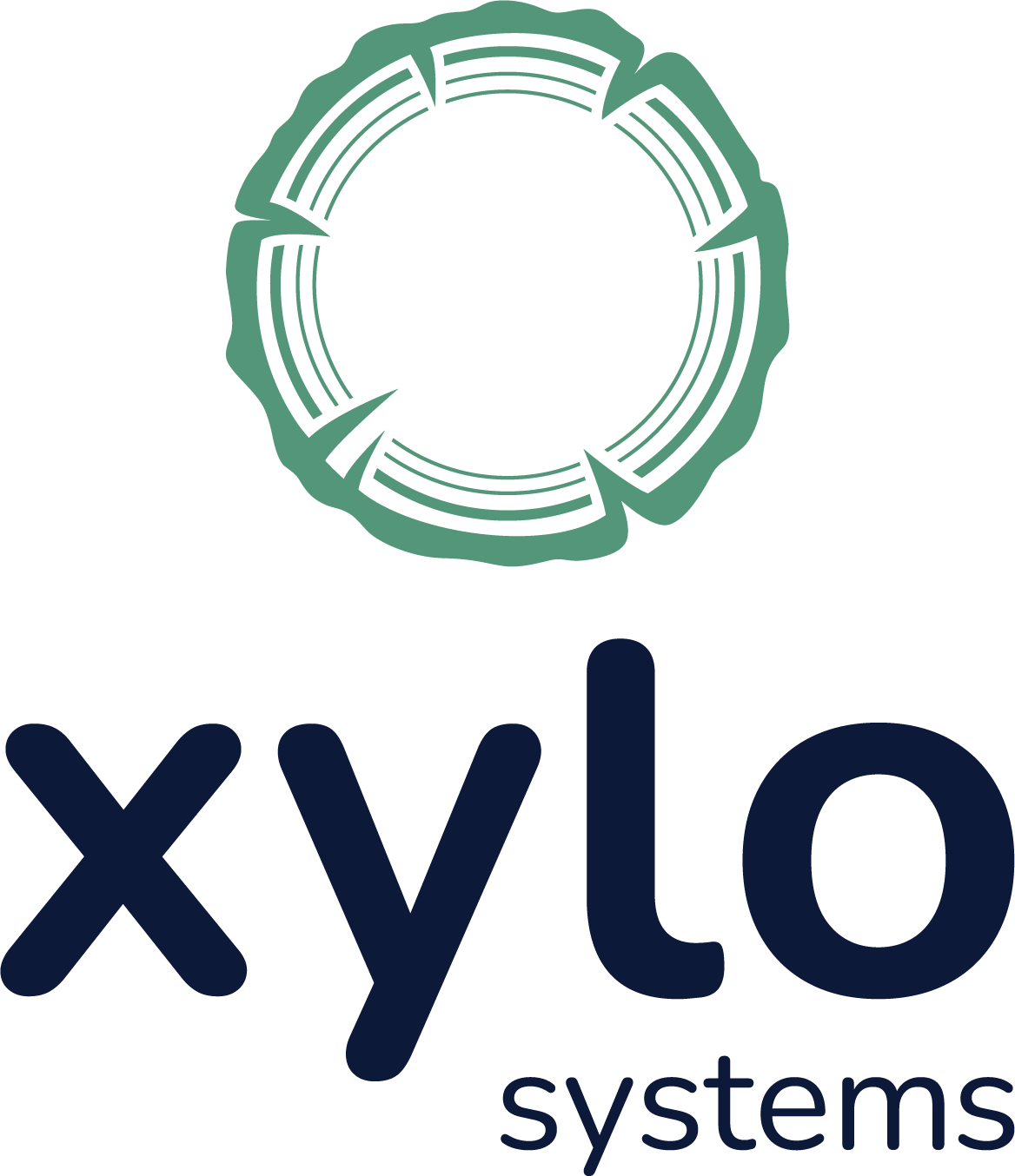
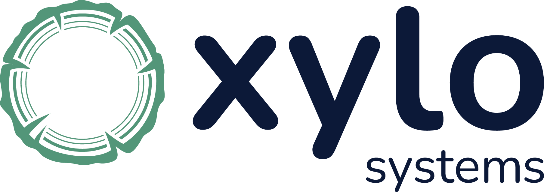
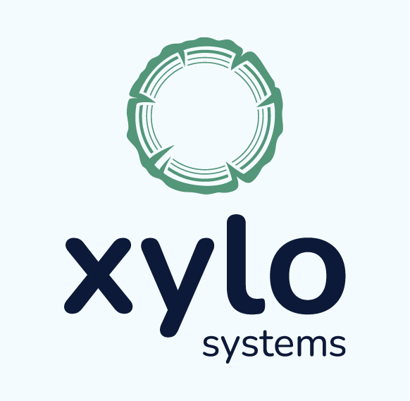
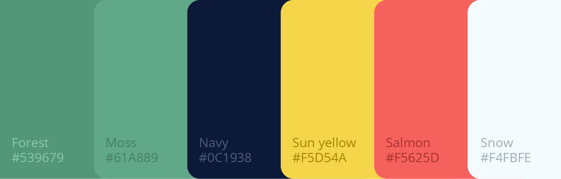
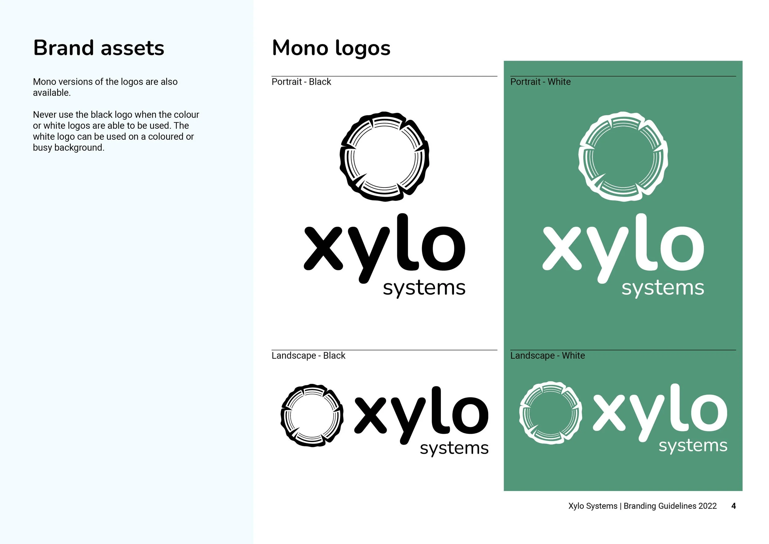
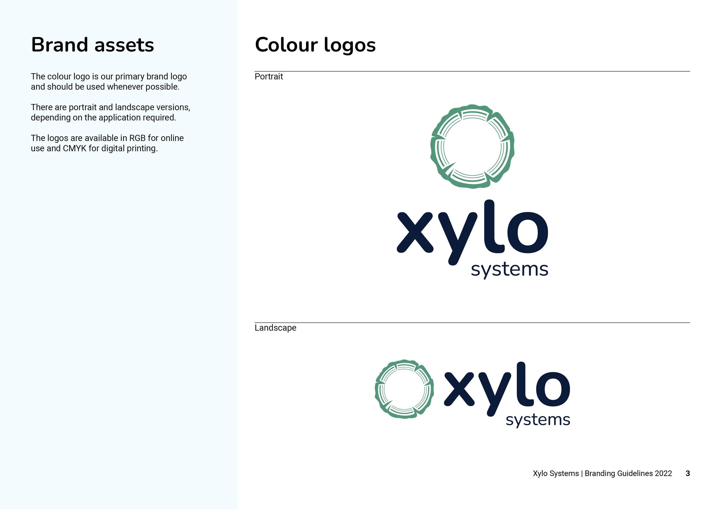
To meet the challenge, I designed a logo inspired by tree rings, symbolising Xylo's commitment to ecosystem protection. I adapted their original colours to be bolder, ensuring visibility on tech platforms. The navy typography balances a tech-savvy and approachable look. The organic green reflects the eucalyptus gums of the Australian outback.
Deliverables
Logo concepts
Logo Design
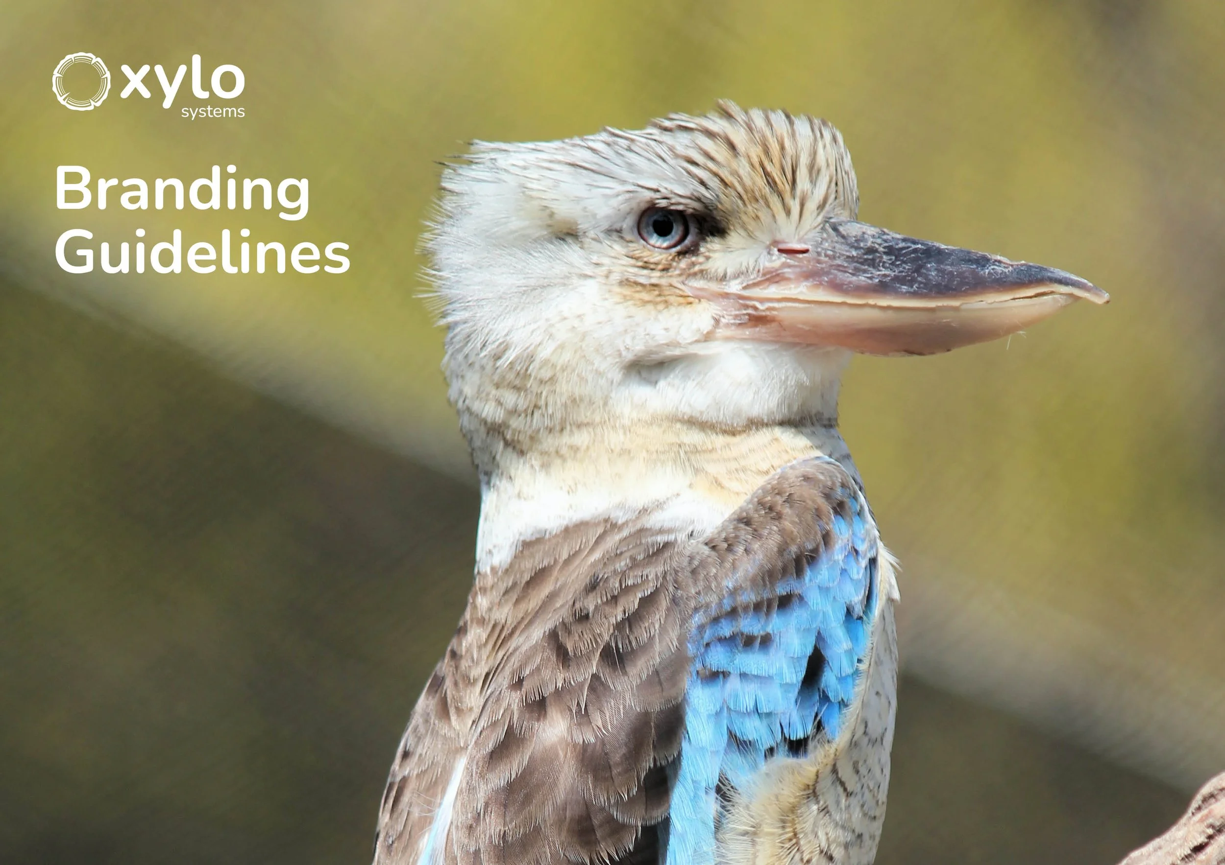
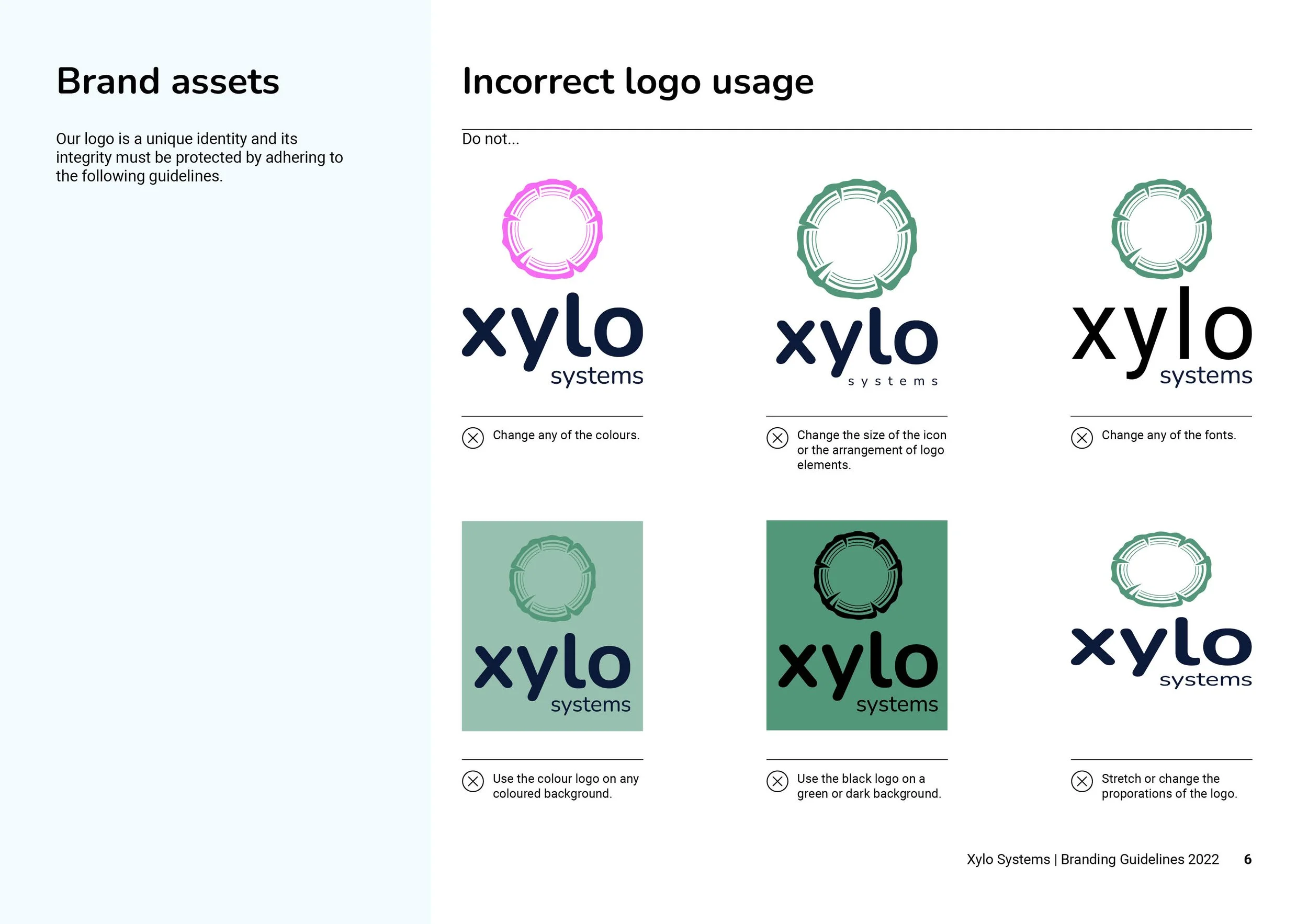
Branding Guidelines
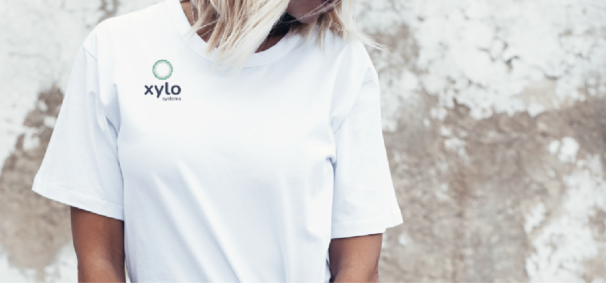
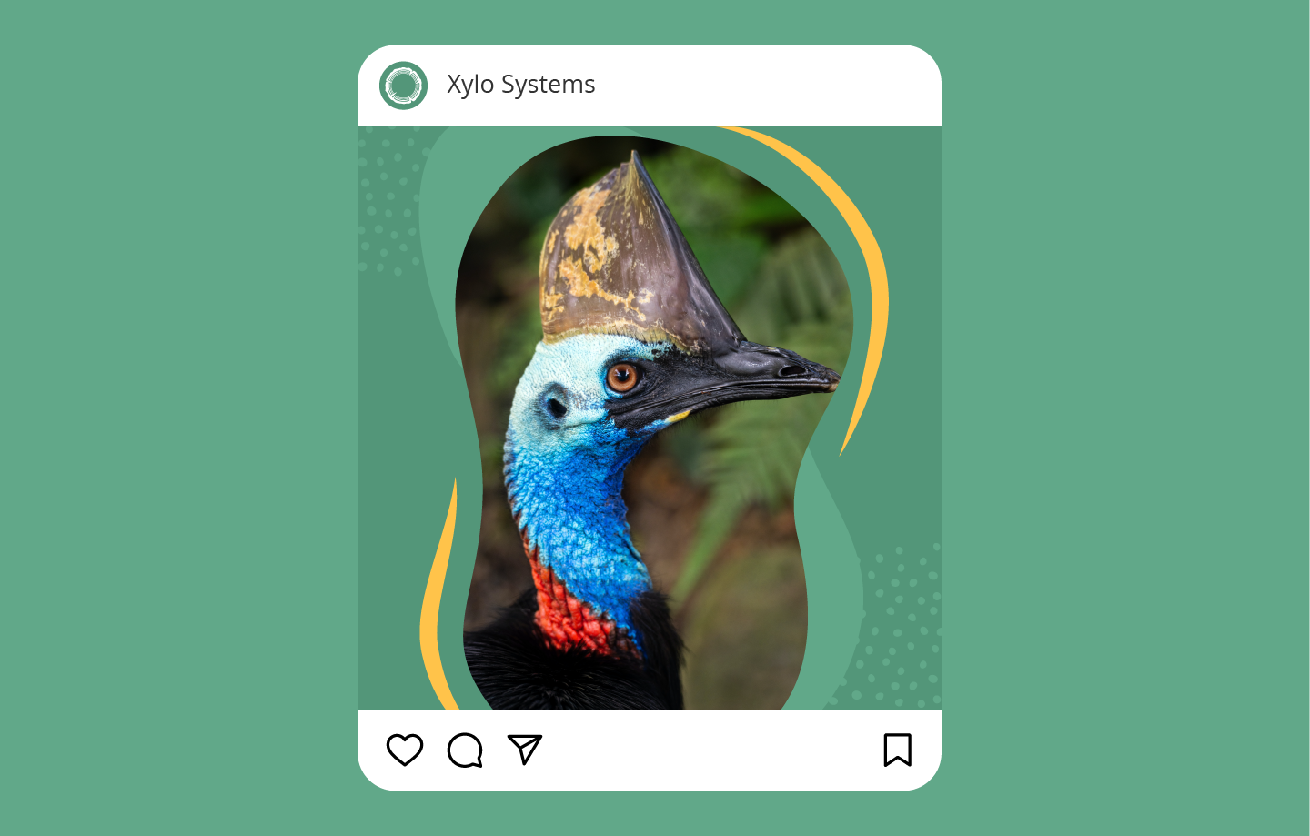
Social media examples


Rebrand
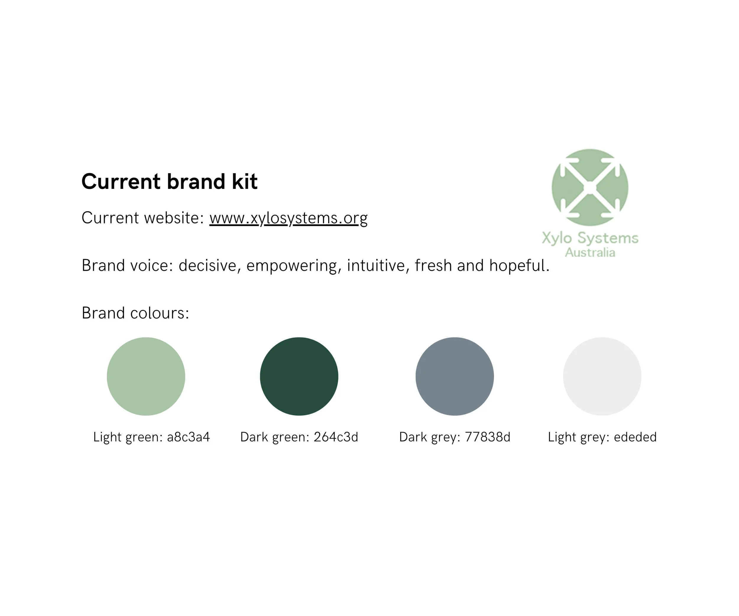
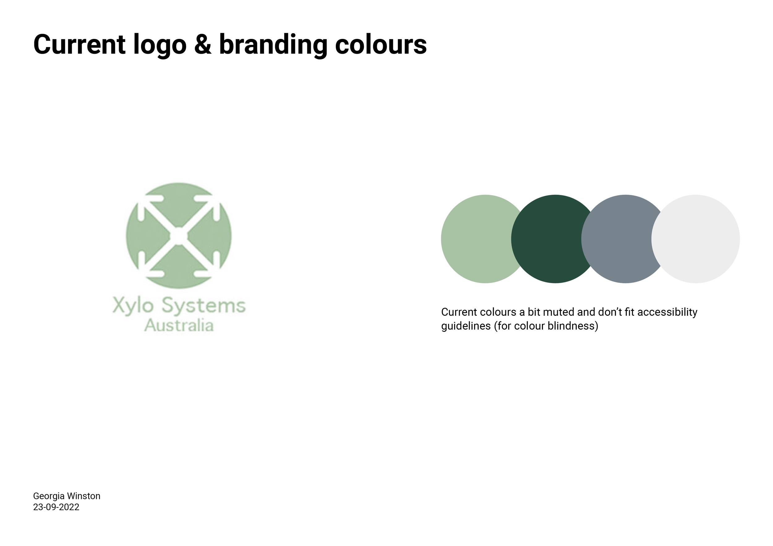
Original
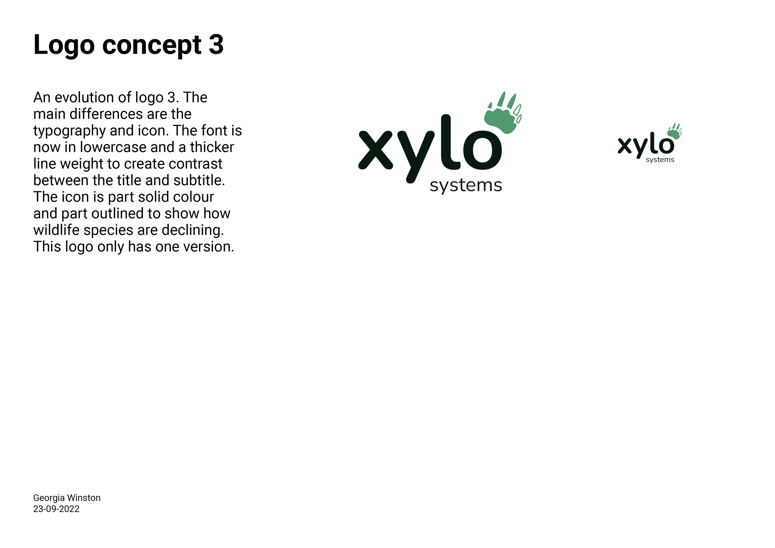
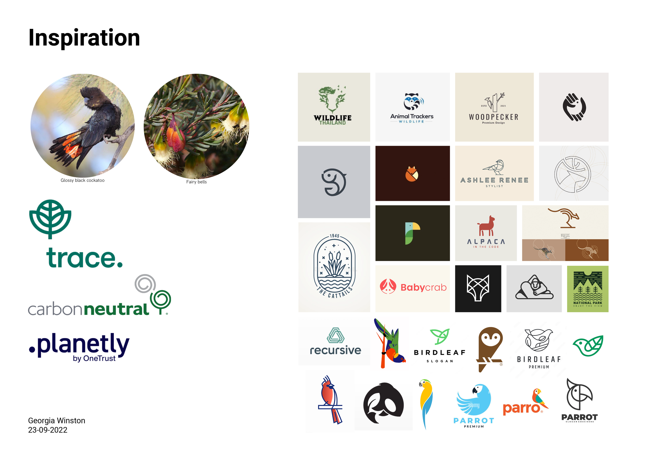
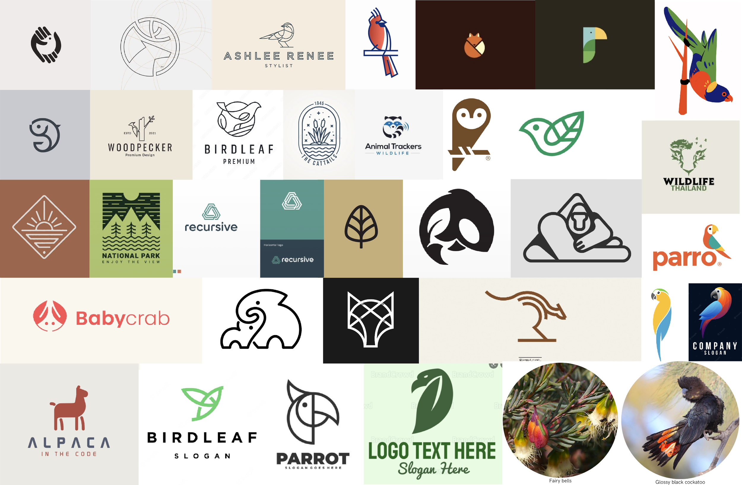
Research into tech and biodiversity logos revealed a preference for line work, simple shapes, and sans-serif typefaces, which inspired the design direction. Animal footprints and organic shapes were used in the ideation process to symbolise Xylo’s dedication to biodiversity.
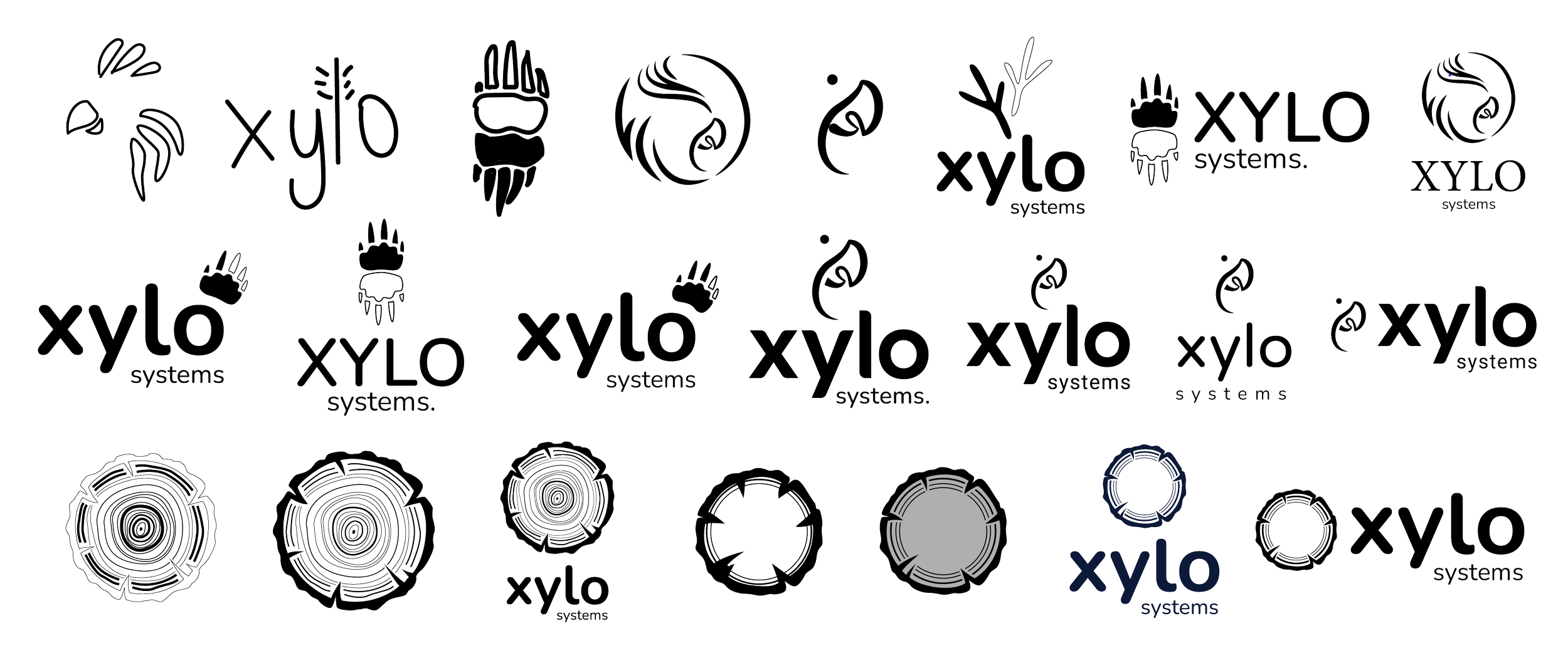
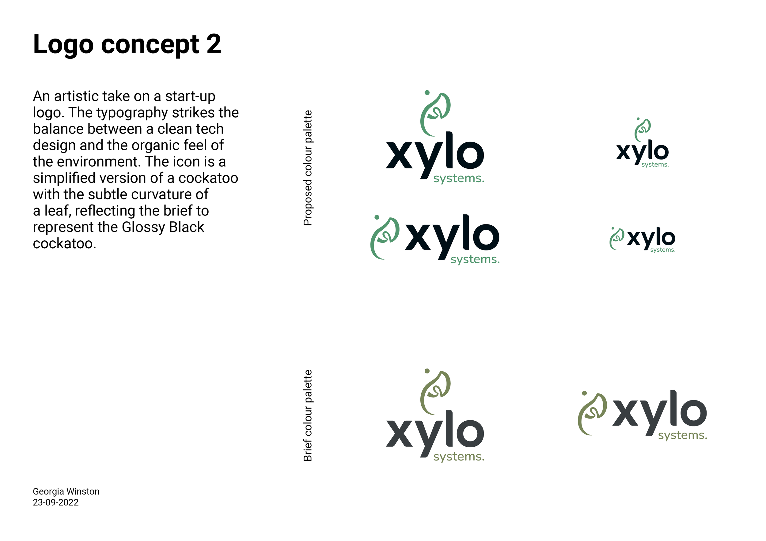
I developed three logo concepts and a branding palette in the client presentation shown below. The client chose the first concept with a colour version.