Oxford Agency
Branding and UX/UI design
Oxford Agency is a boutique real estate agency based in Surry Hills. They work across residential and commercial property, including sales and leasing.
Challenge
Oxford Agency needed to honour a deep family heritage rooted in Sydney's inner city while signalling a fresh chapter for the next generation. Premium, but never exclusive. The existing brand and digital presence didn't reflect the depth of expertise behind the name.
My Approach
Competitor analysis revealed a market defaulting to either cold prestige or over-familiar warmth. Oxford's opportunity was the space between: cool authority. We named this positioning Urban Mastery; architectural precision combined with the lived instinct that comes from truly knowing a place.
Deliverables
Logo & Branding
Photography
UX/UI Analysis
Website Design and Development
UX Design
A requirements workshop and UX analysis of Bresic Whitney, Belle Property, and McGrath identified the priorities: listings, search, and strong calls to action. From there, I built an information architecture that separated residential and commercial into distinct journeys, each tailored to its audience. Wireframes mapped how modular content blocks would work together, ensuring every visitor finds their path without friction.
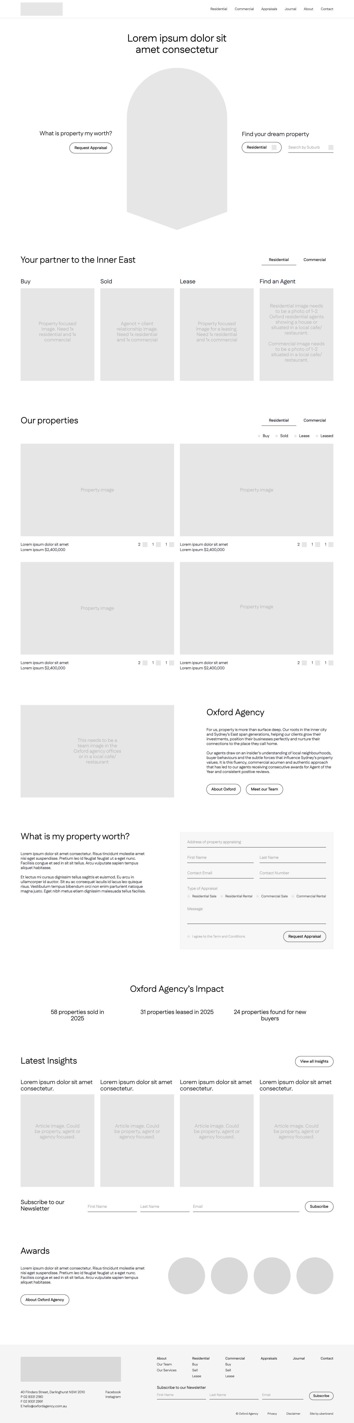


UI Design
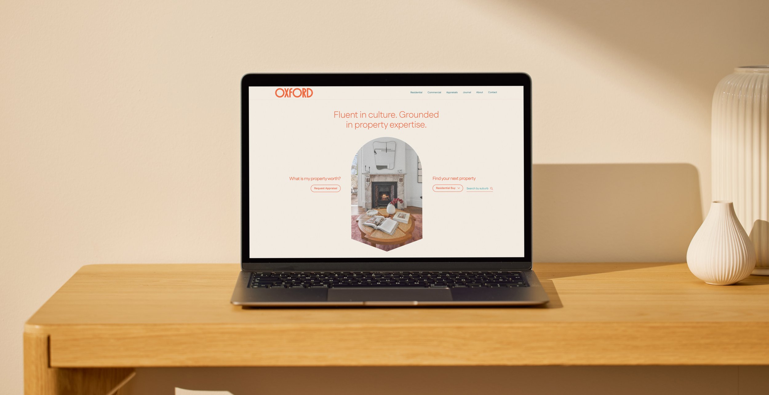
Figma designs are clean, well-constructed, and built for handover. Consistent naming conventions and a considered component system mean any developer can pick up the file and build with confidence. The visual identity carries throughout the site, with animations that bring the city's pulse to life. Post-launch, I provided ongoing support so the Oxford team could manage pages and listings in WordPress independently.

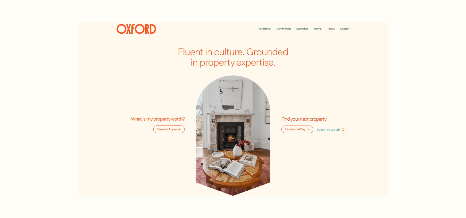
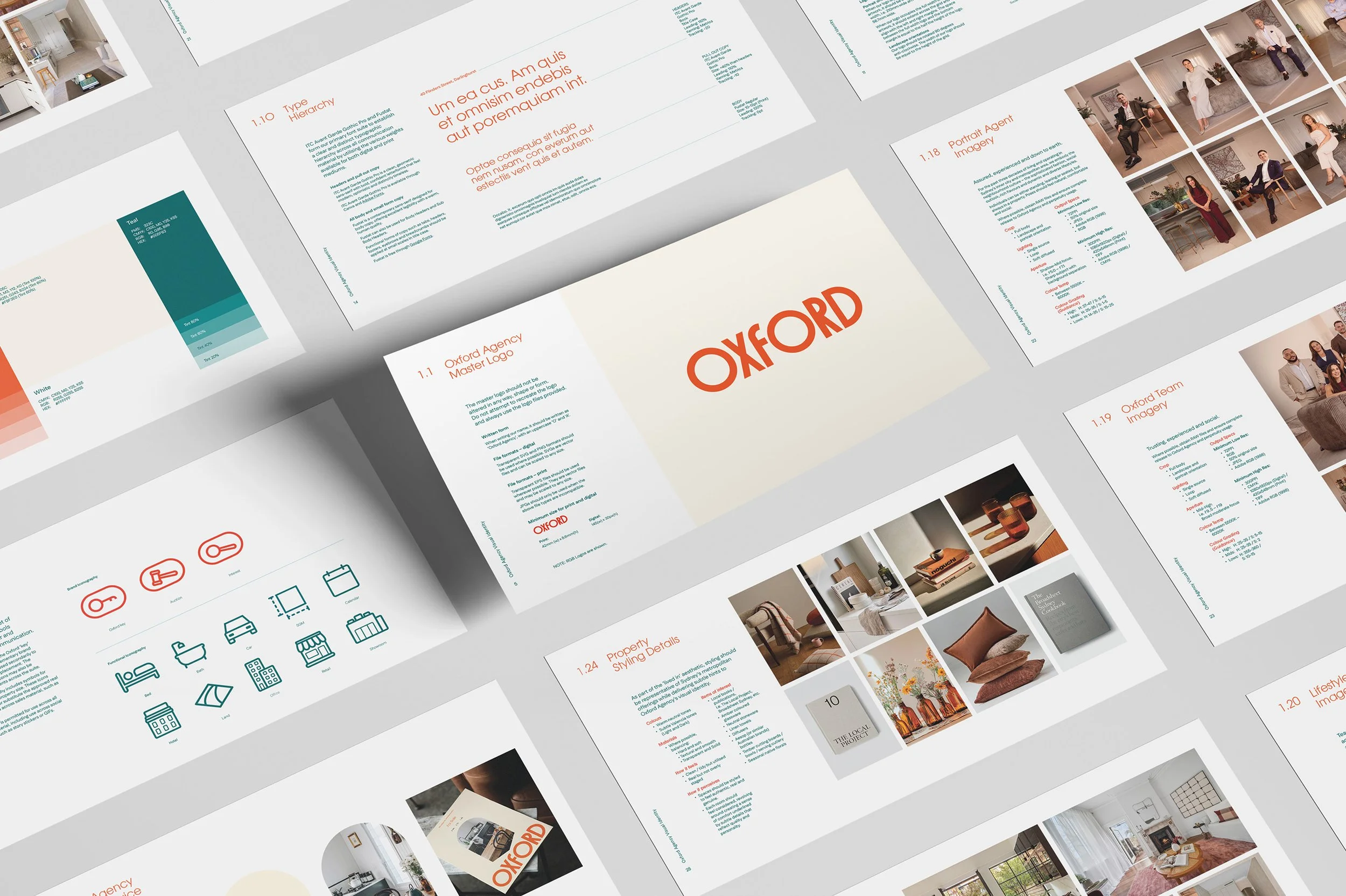
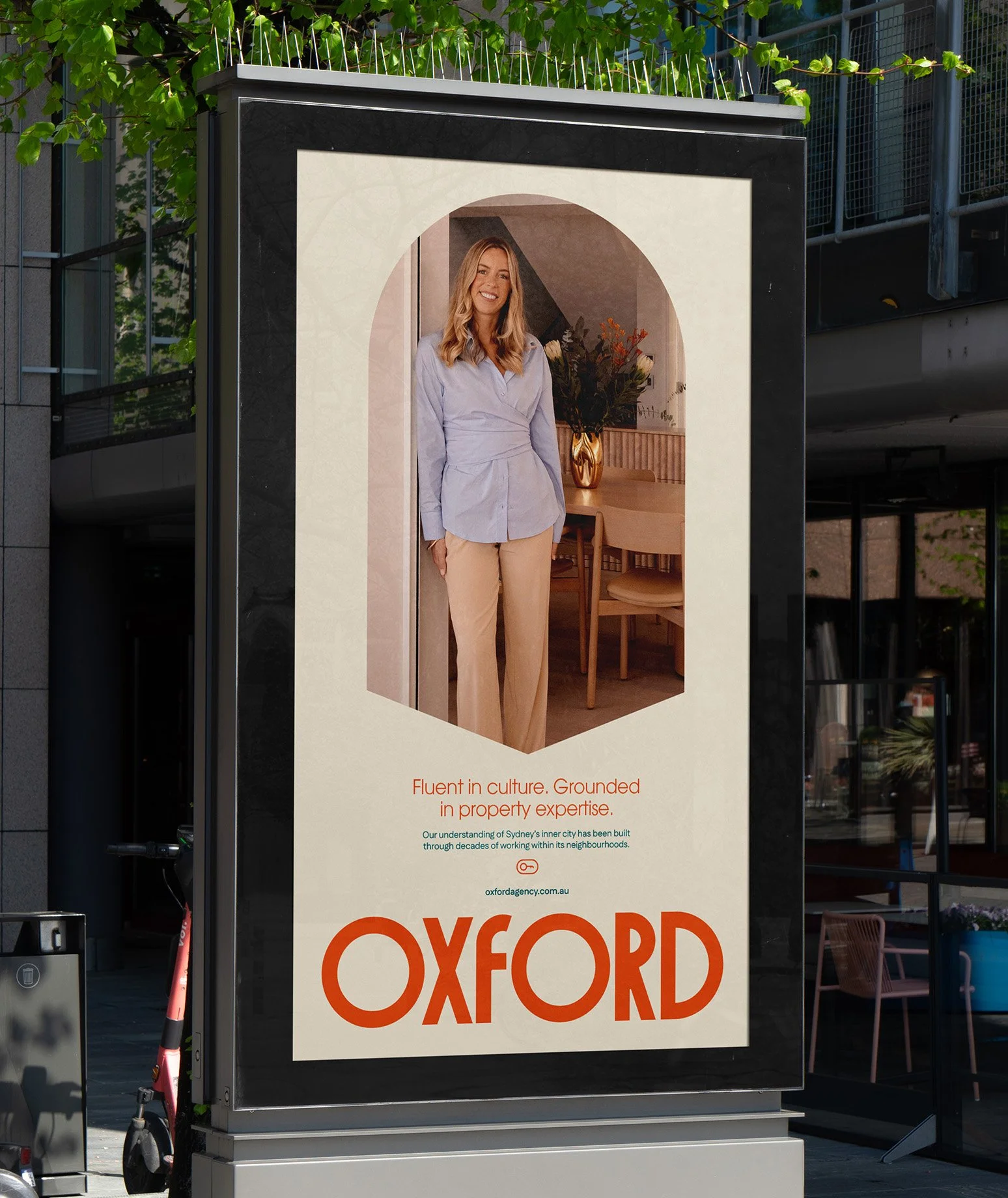
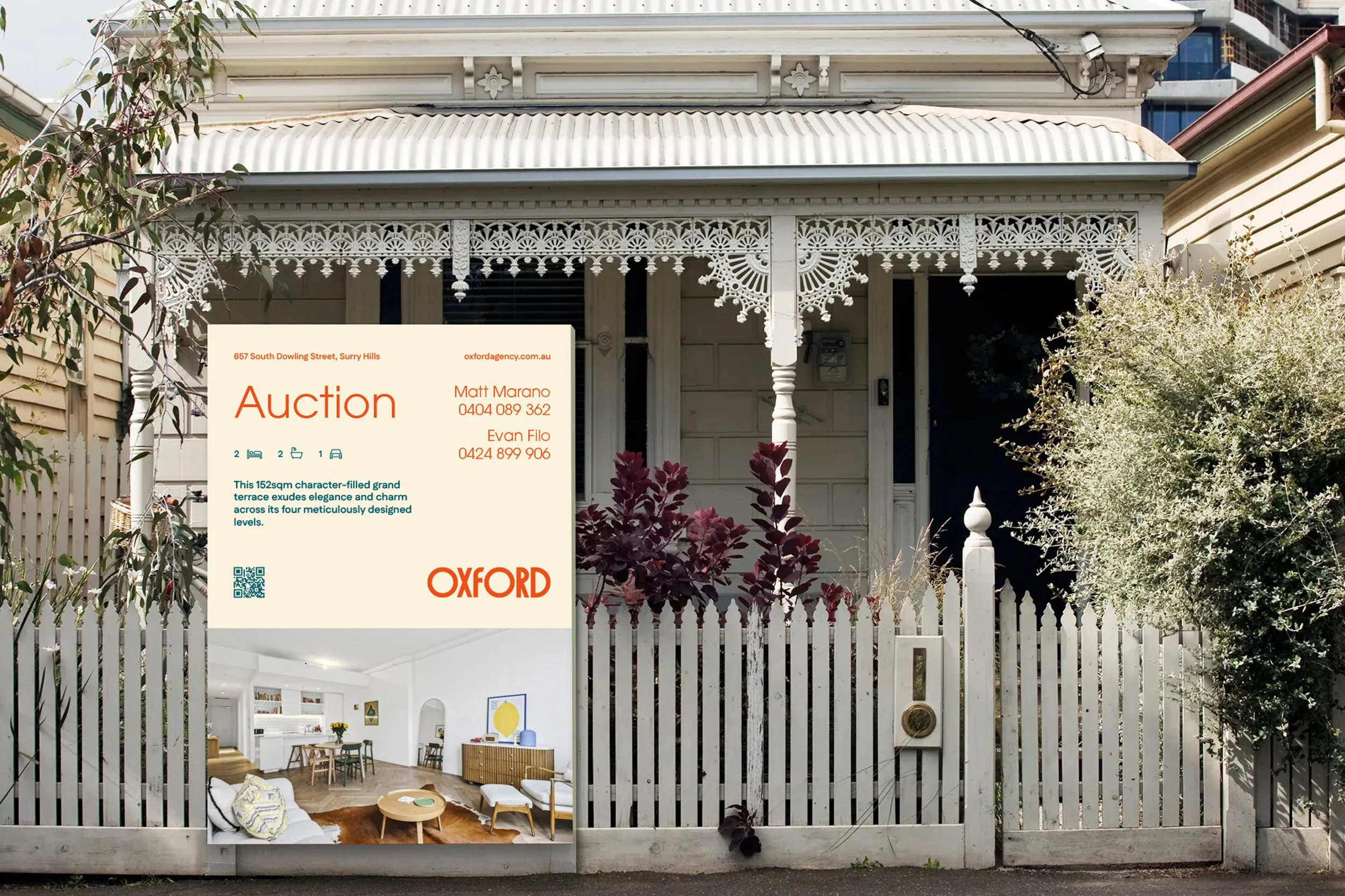
Visual Identity
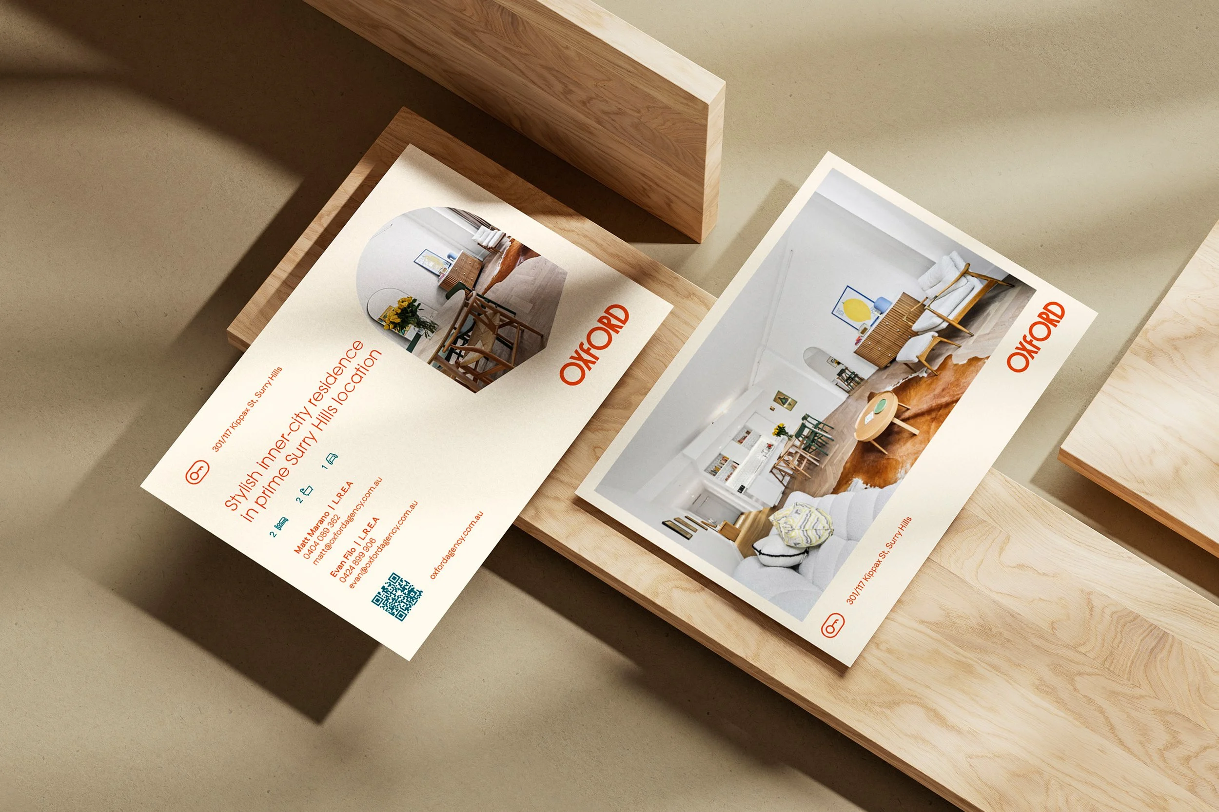
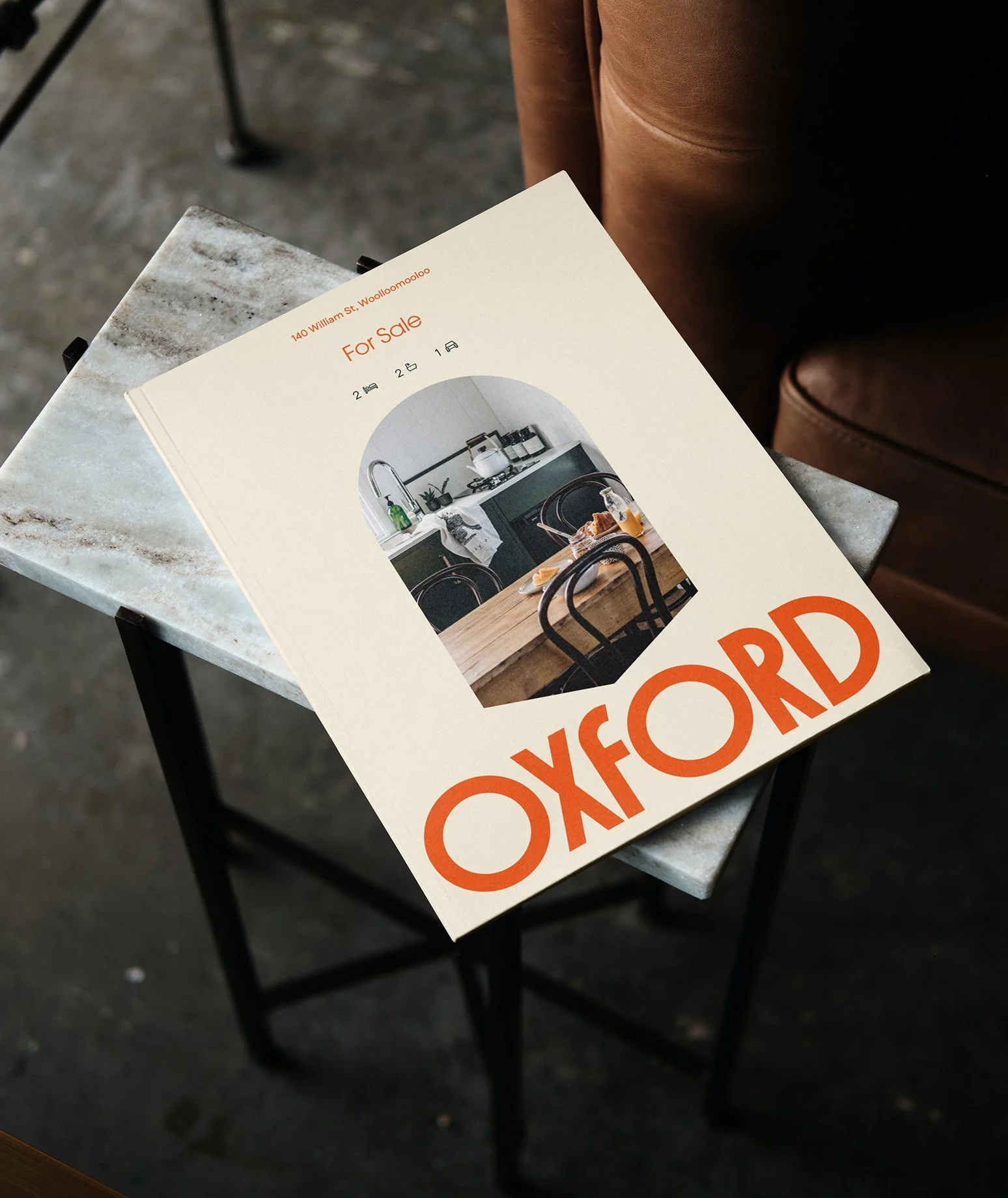
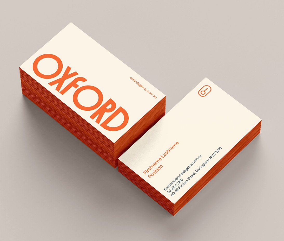
Cool Authority tapped into the authentic rhythm of the city through art deco-inspired typography, lived-in imagery, and the energy of Sydney's inner suburbs.
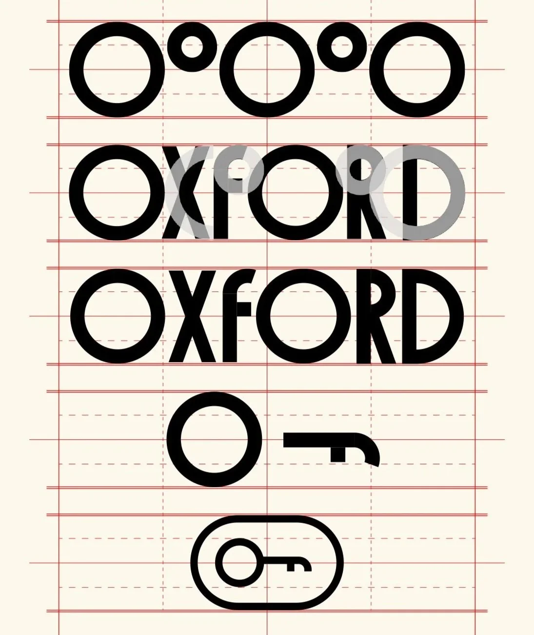
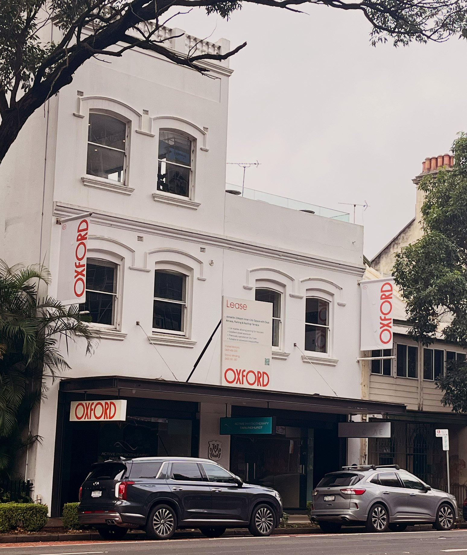
Wordmark exploration uncovered an unexpected asset: the negative space between the 'O' and 'X' forms the Oxford flag, a framing device used across print and digital. From the same letterforms, we derived the Oxford Key icon and a textural pattern for backgrounds and signboards.
The palette pairs Valencia orange with crema and dark teal, warm, distinctive, and immediately ownable. Rounded headlines and clean body text reinforce cool authority, underpinned by an editorial grid system across all formats.