Sutherland Urban Planning
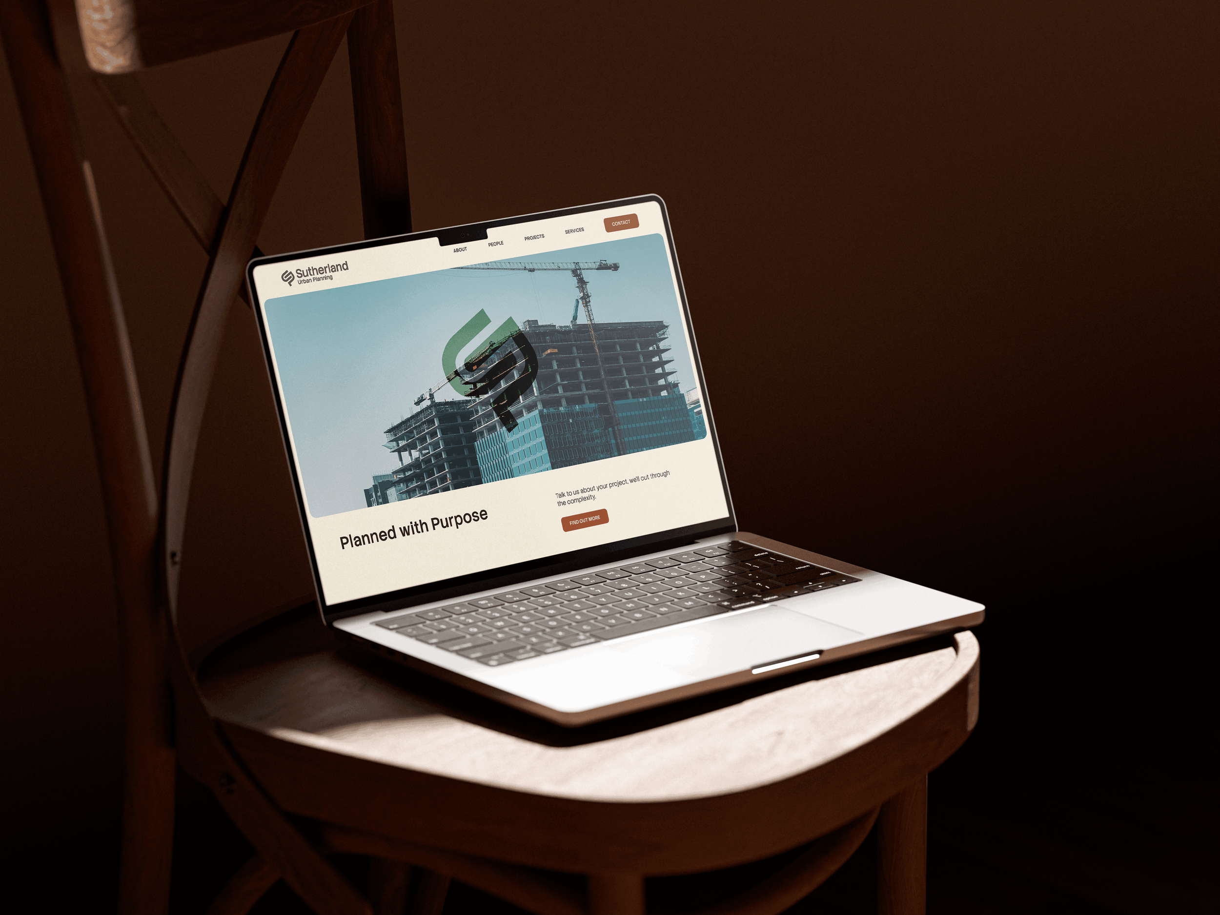
Branding and UX/UI design
Sutherland Planning offers statutory and strategic town planning services, from development applications to Land and Environment Court expert evidence.
Challenge
To establish Sutherland Urban Planning as a credible, recognisable and enduring urban planning practice through a distinctive visual identity that reflects expertise, trust and confidence.
The initial brief called for a type-only logo, no icon. I was asked to challenge that assumption.
Solution
I developed three logo concepts, two built entirely on type. The winning direction was a logomark and logotype pairing rooted in the systems and structures that make cities work: the maps, the intersections, the careful logic of how places connect and grow. It positions Sutherland as a practice that doesn't just understand the built environment but genuinely navigates it on behalf of its clients.
Deliverables
Logo + Branding
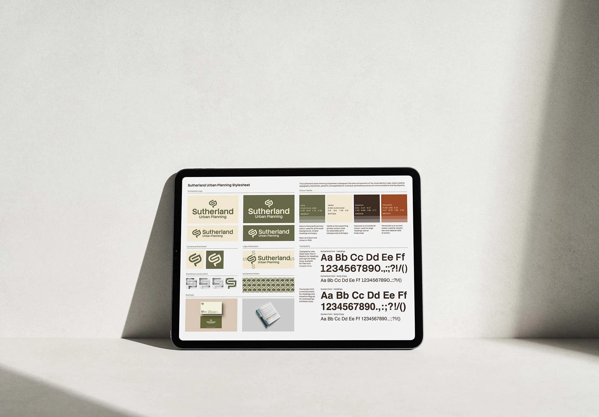
Stylesheet
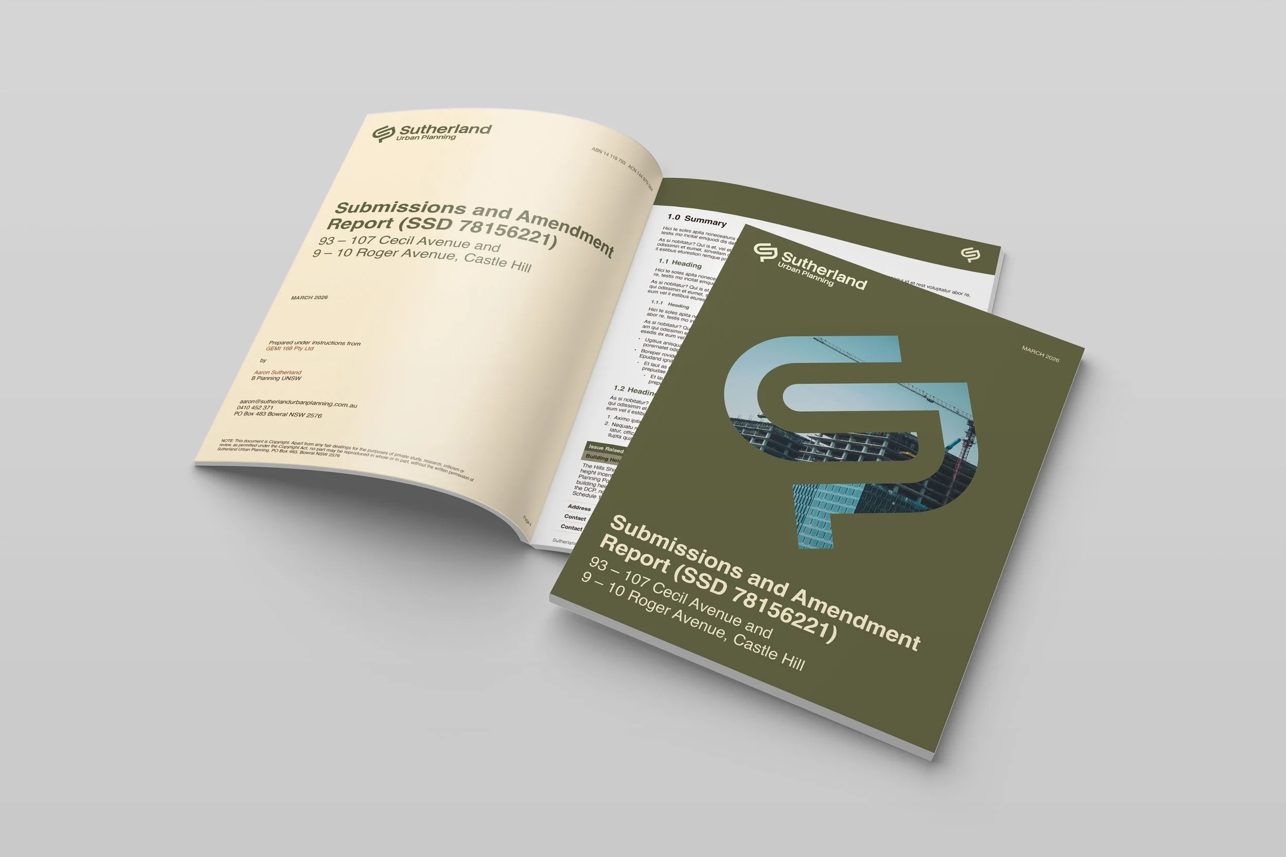
Report Templates
Business cards
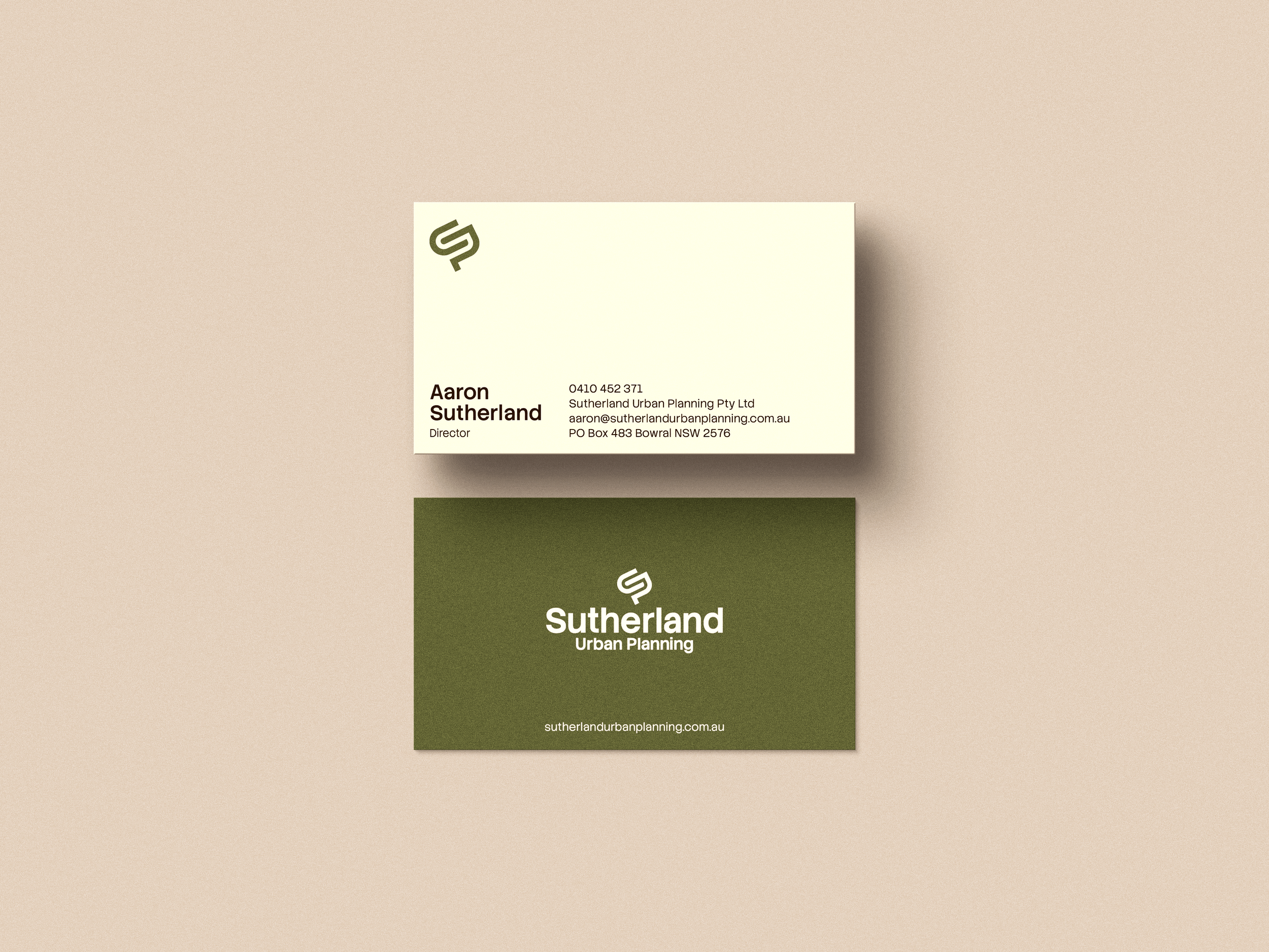
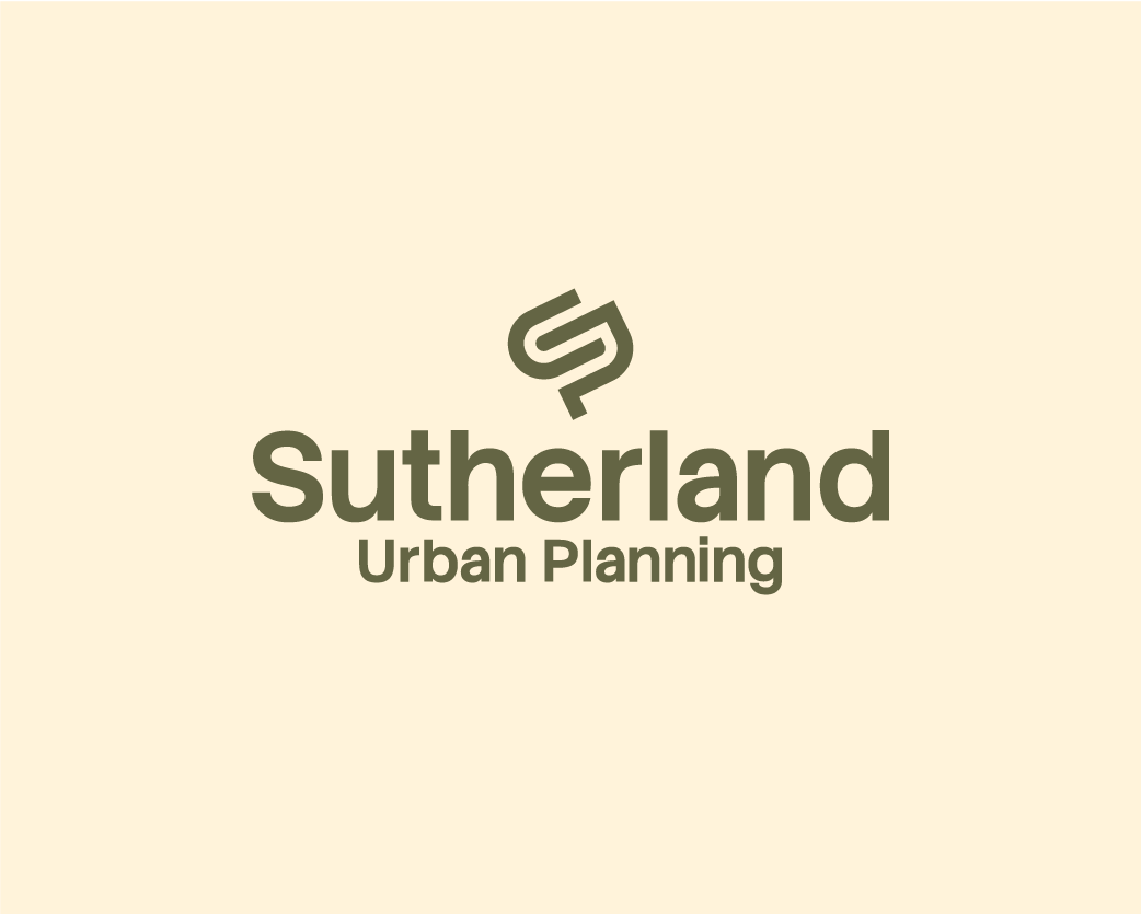
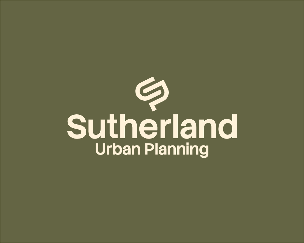
Visual Identity
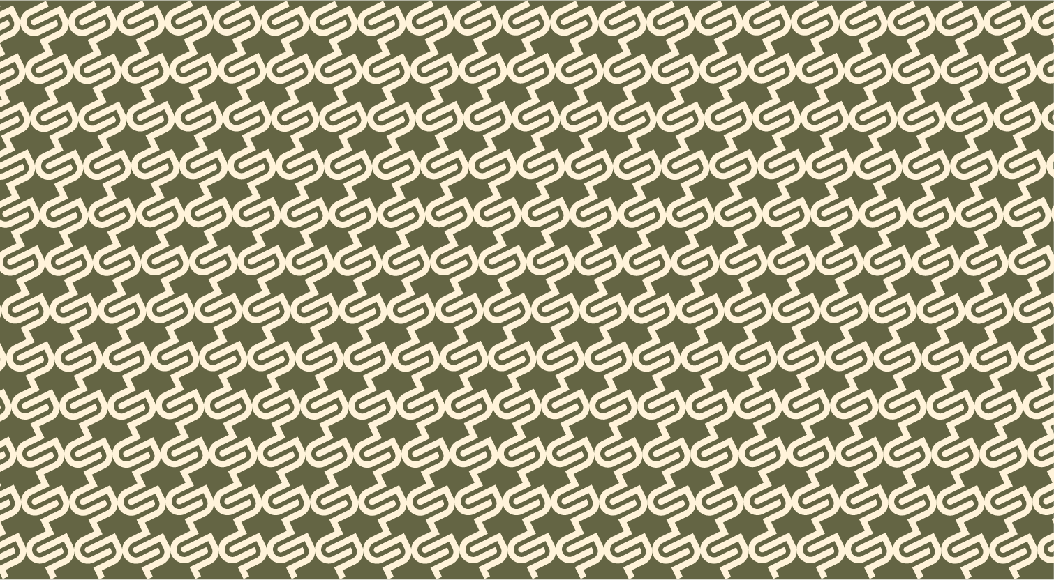
The final identity pairs a refined wordmark with an SUP monogram, supported by a custom pattern built from the same intersecting line language for use across branded assets. A warm, grounded palette of espresso, vanilla, olive and terracotta gives the brand authority without losing approachability, paired with a humanist geometric typeface for clarity across reports and digital touchpoints.